Saturday, May 13, 2006

First & Second Floor Grocery Concept Statement & Board


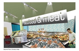
To complement the revitalization of Downtown Baton Rouge, Louisiana Harvest provides a one stop food and wine shop for the young professionals of the surrounding areas including Beauregard Town, the Garden District, and Spanish Town. Catering to the young professionals of the area the atmosphere combines convenience and quality. By providing one level of fast access pre-prepared goods and a second level of more specific items Louisiana Harvest meets the needs of all its neighbors and future customers. The use of color in combination with fine materials and finishes creates a clean and fresh approach to grocery store design that reinforces the quality of products offered to the public.

Fourth Floor Wine Bar & Third Floor Wine Sales Concept Statement & Board

On the Fourth Floor wine bar and the Third Floor wine sales loft, sleek and modern furniture create a relaxing and sophisticated environment. In addition, the arrangement of the furnishings including an elliptical shaped bar accentuates a view of Downtown Baton Rouge from this former Gordon’s Jewelers building. The use of accent lighting, modern art, and glistening tile add balanced character to this wine savvy space creating an atmosphere that welcomes couples, groups, and singles.

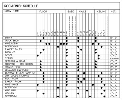
Finish Schedule & Legend


First & Second Floor Grocery Finshes & Materials Board

Third Floor Wine Sales & Fourth Floor Wine Bar Finishes & Materials Board

First Floor Rendered Floor Plan

First Floor Perspective

Second Floor Rendered Floor Plan

Second Floor Perspective

Third Floor Rendered Floor Plan

Third Floor Wine Sales Perspective

First, Second, & Third Floor Furniture Specifications

Fourth Floor Rendered Floor Plan

Fourth Floor Wine Bar Perspective

Fourth Floor Wine Bar Furniture Specificaions

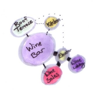
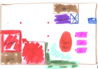
Bubble Diagrams


First & Second Floors

Fourth Floor

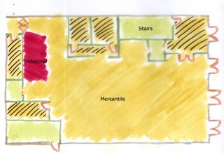
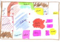
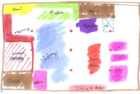
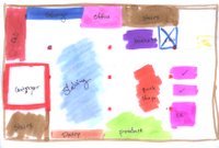
Block Diagrams

First Floor
Second Floor
Third Floor
Fourth Floor

Stacking Diagram

Daylighting Studies

First Floor

Second Floor
Third Floor
Fourth Floor

Circulation Studies

First Floor

Second Floor

Third Floor


Fourth Floor

Daylighting Model

Occupancies

First Floor

Second Floor
Third Floor

Fourth Floor

Sunday, April 23, 2006

Lighting Systems and Specifications

ED17 Lytespot

The clean architectural lines of the rugged ED17 Lytespot will compliment any interior environment where there is a need for high ambient light levels and energy efficiency.

Specifications: http://www.lightolier.com/MKACatpdfs/83ED17RS.PDF

Pendalytes

Powerful lighting for high ceiling spaces. Created in a range of distributions, styles, lampings, and wattages, Pendalytes meet the demanding needs of a variety of commercial and institutional applications including retail stores, supermarkets, community centers, schools, and transportation terminals. Choose between Modularized 9", 12" and 16" diameter Pendalytes as well as New Performance 6.5" and 12" Pendalytes in either pressed opal glass, anodized aluminum or injection molded acrylic.

Specifications: http://www.lightolier.com/MKACatpdfs/PENDALYTECONVERSION16.PDF

Lighting Systems and Specifications

ED17 Lytespot

The clean architectural lines of the rugged ED17 Lytespot will compliment any interior environment where there is a need for high ambient light levels and energy efficiency.
Pendalytes

Powerful lighting for high ceiling spaces. Created in a range of distributions, styles, lampings, and wattages, Pendalytes meet the demanding needs of a variety of commercial and institutional applications including retail stores, supermarkets, community centers, schools, and transportation terminals. Choose between Modularized 9", 12" and 16" diameter Pendalytes as well as New Performance 6.5" and 12" Pendalytes in either pressed opal glass, anodized aluminum or injection molded acrylic.

Specifications: http://www.lightolier.com/MKACatpdfs/PENDALYTECONVERSION16.PDF

Thursday, March 30, 2006

Update 3/30/06

This week I continued to work on my floor plans as well as my material boards. I sketched out my ideas for the boards which I will scan in tomorrow to post on this blog. I will have one board for the grocery store and one for the wine bar. These boards will serve more as a concept statement than specifying boards. In addition to these materials/concept boards I will have separate boards for my perspectives and floor plans. Below are the materials to be used in the wine bar area on the 4th floor.

Response on Floor Plans from Mentor Jamie Donaldson

1st floor - Nice job of space planning w/ stairs/elevator/office/restrooms – it looks great. I love the lobby area up to the wine bar! It’s an excellent way to prevent shoppers from wandering about the grocery store after hours. You may consider adding a door on the other side of the elevator on the first floor too so grocery shoppers can easily access the elevator from the sales floor. You’d have to do a little research first to determine if you can control this door to only open during certain times – it may be locked after grocery hours (not sure if this is possible).
Your shopping pattern is a bit confusing on the first floor – try to define the circulation a little more. You may also want to leave a little more space between displays – it seems a bit tight and the back area looks bare. What are the 2 spaces near the rear of the store?

2nd floor – How do customers exit the elevator – be sure to leave space to exit the elevators and also enough space so other customers waiting to get into the elevator do not block other shoppers on that floor. You have a much better defined circulation pattern on this floor. Good idea of the frozen food alcove area – this is a popular selling item at this time – customers will find it even if it’s a little hidden. Make sure you have some signage to direct people here.

3rd floor - You’ll probably need a small walk-in cooler or probably just a 3 door reach in cooler within the bakery area for certain items. Are you planning to sell any prepared foods like soups, fried foods, etc? Just curious b/c it looks like you have equip only for baking. You would probably need a scale and wrap in the meat dept near the conveyor belt. That way the meat is ready to be put on display once it reaches the 2nd floor. You definitely need a meat cooler and freezer on this floor. Also would need a produce cooler – I’m assuming the space w/ tables and sinks is the produce prep area? You have plenty of space to add these on this floor b/c your dry storage area is larger than you’d need. For dry storage, you may consider pallet racking along perimeter walls. It’s 4’ deep and comes in various lengths of 4’, 5’, 8’ among others. This could accommodate for pallets or large bulky items to be stored and easily retrieved.

4th floor – Very cool layout! Clever idea of the elevator door opening the other direction and different seating types to please singles, couples, and groups. I’d go there!

Customer service area is not super important but it’s nice for customers who need extra assistance. You could very easily work a window or small counter into the office space on the first floor. One of our stores has one of those doors that the top portion and bottom portion can be separated with a counter built into it. This would allow for the door to be completely closed or closed at the bottom with a service counter.

I hope this helps and I loved seeing your ideas! I can’t wait to see some design sketches/colors/signage. Thanks for the Whole Foods pics – I’ll try saving them from your blog. Keep up the good work and thanks for the good luck – I could use all that I can get.

Saturday, March 11, 2006

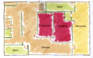
Bubble/ Adjacency Diagrams


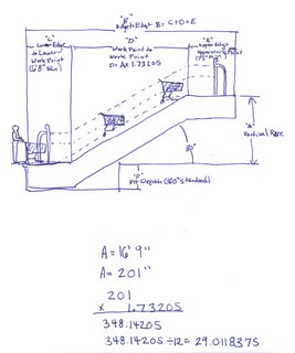
Cartveyor Sketch

Section Elevation Sketch